Tuesday, 10 January 2012
PPB Alight - Applying the logo to...
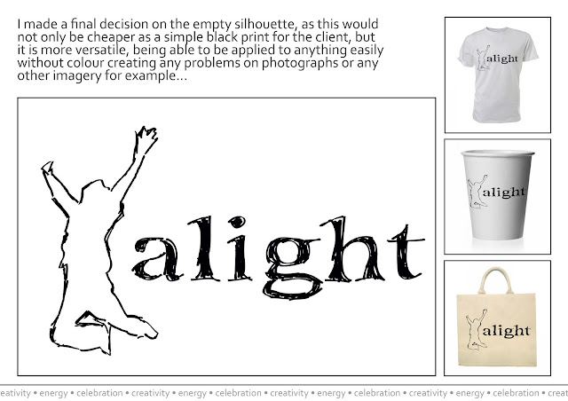
Throughout the event there might be the opportunity to sell refreshments and perhaps other souvenirs, therefore, I sketched a few ideas of items the logo could be put on, then recreating some in photoshop. Items such as cups and bags would be walking adverts for the event thats going on:
Sunday, 8 January 2012
Saturday, 7 January 2012
PPB Alight - Simplifyingggg...
Trying a new simplified version, I looked at making the font look arty and creative to represent what I think Alight is all about.
From these pieces I then looked further into the positioning of the man, and his sizing:
Firstly I used the original abstract, sharp, silhouette of the man, taken from the previous designs, however, I felt he didn't work very well with the font chosen. So in the same sort of style, I recreated the man drawing him myself in a sketchy manner and applied it to the text:
I varied the font between regular and bold, to see how they worked with the silhouette man being empty himself. I think when the font is bold it is more dynamic within the logo, but when it's regular there's more of a battle for dominance.
Therefore, I decided to fill the man in black and see what the weightings would be then:
Again with only the filled in man and hollow text, the man is more prominent, whereas it is a battle again when they are both filled in.
Thinking about bringing some colour into the logo I played about with the logos again, altering the colour of the man:
I used these colours as red is always a very strong colour within branding, plus, they're typically british, which the festival is!
Subscribe to:
Comments (Atom)


