Sunday 30 October 2011

General - Repeat Patterns on Photoshop

Making a repeat pattern on photoshop

Simple:
One image, split and made into a repeat pattern in a grid.

Stage one: centred image


 Stage two: the image split vertically


 Stage three: the image then split again horizontally


Stage four: the image then tiled creates a repeat pattern

General - Idea Development

To reflect the two opposites simple and ornate, I am going to show this in how I construct the patterns. From a simple repeat pattern, to a more visually complicated pattern, however still using the floral elements I have used before.

Sunday 23 October 2011

General - Cath Kidston

After learning how to make a repeat pattern I looked at Cath Kidston to inspire my floral prints before I generated them. She is a great influence for both simple and ornate patterns, I love her work, and she's very current at the moment.


Being such a brilliant pattern artist she covers the range of simple to ornate:

From simply spots and stripes...
...to busy floral patterns

Looking at repeat patterns and floral designs in particular myself, Cath Kidston really showed me what kind of things can be created, and what they can be applied to. Cath Kidstons pattern work is applied to a whole range of products:


General - Repeat Patterns

For inspiration with my designs I looked into the work of William Morris, I've seen his work at his 'The Red House' as it is in my town at home, some of his patterns are so ornate and detailed!
After looking at his work I wanted to try and create my own repeat pattern, so I looked on the internet for a technique or tutorial and found this:
http://www.designsponge.com/2008/05/welcome-julia-and-how-to-make-a-repeat-pattern.html

Therefore, I tried out a rough pattern to get the technique and idea of how to do it.


So I tried a rough design first, not being too precious about it, which worked really well! The image needed to be taped together closer and the edges needed to be cleaned up when scanned in to make it neater as you can see the tiled image, but for a first try it was pretty good!

Therefore I tried it again, however making it more complicated and neater, making the join neater and cleaning up the edges of the scan before tiling it. I also tried a longer piece to see how that would affect the turn out.


By joining up the diagonal branch it made the pattern more complicated, and the original tiled image less obvious. 

I liked this technique and am thinking of developing it into my idea to get a greater sense of the words I am using, for example creating a more complicated pattern, still using the floral patterns and elements as before, and a simpler one, where the grid is perhaps subtler  

General - William Morris

I've always known about William Morris as 'the Red House' is in my town back home, therefore, having visited before I am familiar with his work, and looking at pattern design he is a very clear and obvious influence for me.

William Morris' work is so ornate in the amount of detail he gets into the patterns! Even those that are simpler in comparison are still incredibly elegant and detailed, making incredible work.

For the ornate end of this task I feel William Morris is a fabulous influence, his use of organic shapes and floral themes link really well with the kind of route I'm going down... however he isn't particularly good for the simple end!


Saturday 22 October 2011

General - Feedback and Advice

After talking to my tutor and showing him my laser cuttings, we both agreed that the piece made from the cut outs was a lot stronger than the whole laser cut piece. Also, I felt that the piece didn't really show the progression from simple to ornate like I wanted it too. After discussions,  I was advised to look into making patterns and perhaps focus on the structure rather than the form in which its demonstrated which is what my piece at the moment seems to do.
I'm going to look at pattern makers and see how repeat patterns are made, and have a go myself and see where it goes from there...

Friday 21 October 2011

General - Laser Cut Outs

From the cuttings of laser cutting the black piece I decided to use the pieces and see what I could do with them


I felt like this piece was much stronger than the cut out before, it wasn't planned, but I had control of where each element was placed, as well as selecting the pieces to match the shape best. 


Thursday 20 October 2011

General - Laser Cutting

Where some of the detail was lost on the original pattern, I altered it on photoshop moving some elements and resizing them so that gaps were bigger and lines didn't overlap.


I recut this on the laser cutter again, however the black paper didn't cut, which was annoying. I wasn't sure what I was doing wrong. I also reversed the colours, cutting it out on white, backing it on black, which I felt was stronger, having the elements in black, like the composition I made with the cut outs. I wanted to do this again and explore different layouts and see if I could make a stronger link between simple and ornate, but as the black didn't cut. This messed up my plans. 


Saturday 15 October 2011

General - Opposites Pattern

Once my pattern was finally drew up, I scanned it into the computer and putting it into illustrator, live traced it to turn it into a line drawing. From this file I was able to export it into a file suitable for Coreldraw, and laser cut the pattern out.


I started by using A4 black card, I was concerned that my pattern may have been too close together and I'd loose parts of the design when it was cut out, however, this surprisingly was not the case! Hoorah. I was impressed by the impact it had, and was really pleased with the outcome! I'm going to try cutting it out on white, backing it on black, and maybe try adding colour. I'll do all this in a4, then scale it up to a3 for my final piece. 

There were a few problematic area's which were lost, but not many at all. Tweaking the design should fix this, however, the scale I have used needs to be taken into consideration. I'm going to cut it on a3 first and see if tweaking is still necessary. 

Bit messy here where the petals link

Missing a whole section of detail

Missing middle section with detail

I managed to add some of the missing details from the cuttings and stick them on when I fixed the cut out onto the white backing paper


My only concern with the overall piece is that there isn't really a clear 'simple' end. My plan of action to fix this is to try and extend my design and build upon the simple end, or I might experiment with making a series of 3 to have a clearer progression, still flowing from each frame with the shapes. 

Tuesday 11 October 2011

Group Presentation - Uh Oh

So we found out on Sunday night that a member of our group can't make the presentation on Wednesday due to personal reasons, however, we still haven't received any of his, so the whole social section of our presentation is missing, and it's tomorrow.

We spoke to Matt about our concerns today and decided that we will have to make up for the work missing as it'll work in our favour. As it was the social section we used how we communicated as a group throughout the brief via facebook to show how things have changed, especially as facebook was our main connection to each other. It was the main reason people knew what they were doing as well as others, it's also how we found out that we'd be missing a member of our group on the day. Therefore, it was something we'd all be participating with and using throughout, and conveniently tying with the social flux. We didn't have a lot of time to do similar research to what we had done for the other topics, but something live and tested seemed like a strong piece of information to use.

Monday 10 October 2011

General - Rob Ryan

Rob Ryan has a very unique style, in a strange way he is quite sketchy, but all of his paper cut work creates a sense of detail and preciseness at the same time, I love this mixture of sense I get from him. He seems more rough and ready compared to Julene Harrison. From his paper cuts he also uses them to create screen prints of his work.

Rob uses a laser cutter to create his work, which is something I want to explore within in this project, so looking at his work is inspirational and drives my project to see what kind of thing can be achieved with this kind of technology.

He uses a lot of floral organic shapes in the make up of his designs, which again is something I'm veering towards in this project, so seeing different ways in which they were created gives me a push in the right direction.

Blog: http://ryantownshop.blogspot.com/
Website: http://www.misterrob.co.uk

I learnt from researching him at he has a shop in East London, which I want to make the effort to find and visit when I'm home next! I would also love to buy something from there. Also, looking at his work I noticed he has a few books out, one where he has worked with Carol Ann Duffy, who I studied at GCSE english, so a familiar name really interested me, I want to find this book!


General - Julene Harrison

I love Julene Harrison's work, her work is so detailed and breath taking. Looking through her website and coming across a book cover she'd done I found an interview with her, and was impressed to find out that although designing these pieces digitally first they are all hand cut, I like the personal hand made element that brings, she is extremely skilled and must have a steady hand a sharp knife to produce such precise neat work! I was also shocked that these cuttings can only take her a day.

Interview: http://www.scottishbooktrust.com/booktalk/julene-harrison-borrower-cover-design 

Reading this interview also taught me that everything had to be attached to something else so that it didn't fall apart! I felt looking back at Julene's work further than just the visuals of it really helped me push my project forward and gave me a few vital techniques.


Sunday 9 October 2011

Group Presentation - Technological Changes


A lot of it is what we all know and see every day, it seems like life would now be unthinkable without any form of technology what so ever showing just how much we depend on them. 

Its seems like technology has started to replace classic things, such as books, music, writing, we don't have to carry books with hundreds of pages any more, we can make music with little skill on computers, and we now type far more in the way of notes and work than we do handwrite it. But you can't smell or feel a book or written letter, or keep the ones that mean the most to you. 
This is all well and good for computer savvy people of the 21st century, but for some people it's getting more and more complicated, and leaving them behind. 

Technology over technique produces emotionless design - Daniel Mall

So how does all this affect a graphic designer? 

A much larger a wider range of knowledge is now needed from a graphic designer nowadays.

You could be asked to design an app for an iPhone - pretty specific knowledge. Even if you designed the way it looked and perhaps what you wanted it to do, you’d depend on someone else to actually make that happen and bring it to life

Opens up whole new areas which weren’t previously explored

Completely different set of skills to that of printing techniques and processes.

Interface design is becoming one of the most important - yet hardest, areas of design. 


But technology does have some outstanding qualities, one of the most useful things technology has done for design - being able to send files globally within seconds. Clients are able to work with people half way across the world, perhaps only ever communicating via phone, email etc. Just sending work back a forth. Cheaper than flying there for a chat.

Saturday 8 October 2011

General - Opposites

SIMPLE & ORNATE

I finally decided on a pair of opposites, simple and ornate, I chose these words as it would interesting to visually demonstrate the connection between these words.

Again running through some ideas in my sketchbook I looked at different ways I could emphasis simplicity and ornate visually. Thats where I thought about things gradually increasing in detail
I looked at:
mosaics - larger and smaller pieces making up images?
skylines - line drawing gradually becoming more detailed as the strip goes on?
wires - as the wire splits down...?
ropes  - again unravelling?
spot detailed drawings - only one section of detailed drawing/painting?
swarms of animals - the shapes made are denser in some areas and disperse toward edges...


I looked further into the swarms of birds and schools of fish and the kinds of shapes they make...


I liked these shapes because there was a lot of movement in them as well as having denser areas, where things would be more detailed.

Thursday 6 October 2011

General Graphics - Flux 2

Following on from the previous Flux brief, the second task is about Opposites. For this task, I am  only given the theme - Opposites. Therefore it is up to me how I interpret and visually display this body of work. The only guidance really, is to choose 2 words that have a continuous link between them so that there is something in between, and 'visually demonstrate the continuum between the opposites'


Right, so first off, I decided to brainstorm as many opposites I could think of in my sketchbook, and just decide on one so I can get going with this project....

Tuesday 4 October 2011

General - Flux Book

With only a week for this project, I have had to make decisions really quickly on what to do.

I was unhappy with a couple of the pieces which weren't interactive, but photographed, which I think disrupts the flow and theme I was going for, but under the pressure of the deadline I had to get something done, so I did some digitally instead.

Outcome
I felt that this piece was a bit rushed, however, I liked the use of objects for their forms
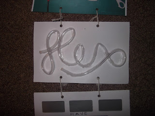
Flowing
Flowing caused a few problems for me, at first I tried filling the tubes with some coloured water so that the audience could move the page around to make it flow, however, I think that the trapped air stopped this from working very well as the tubes were quite narrow. Therefore after numerous attempts I decided to substitute the liquid for something solid. So I went for sugar as it was small and grainy. I was disappointed that what I had envisioned didn't work out, but I think that the overall concept was still put across well.
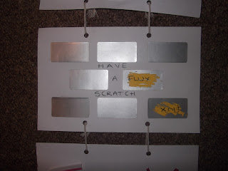
Random
I felt that this was really interactive, the only down fall being that you can only do it once. I kept the piece as plain as possible so that there was no reason for the viewer to pick a specific section to scratch off for any particular or unconscious reasons.

Toxic 
Although this isn't exceptionally interactive I felt that the concept of doing these things made it more so. I used items that would be toxic if you were to burn them, from plastics, to treated wood. 
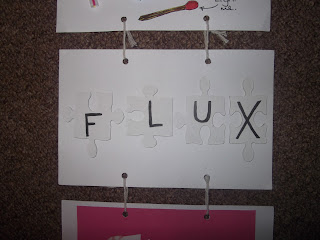
Dysfunctional
Being unable to put a jigsaw together makes it useless and not serve its function. I decided to keep the pieces plain and fix them down because if the viewer did manage to assemble the jigsaw it would defeat the whole point of the piece
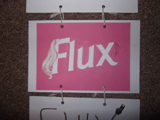
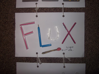
Plastic 
Using barbie as influence I simply designed the word flux and barbied it up, using pinks, the long blonde hair and pink heels, also mimicking the logo with the fonts and positioning. I was happy with the piece, but again I feel it ruins the flow of the hand made and interactive theme I was originally going for.
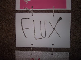
Spiky
 A zip isn't something you initially think will be spiky, but putting it on its edge make any viewer instantly want to touch it, realising themselves the texture.
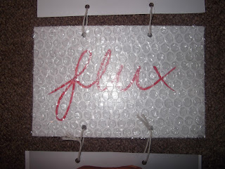
Tempting
I'm really happy with the outcome of this. I decided to use a red italic curvy font behind the bubble wrap to continue to portray the sense of temptation. I experimented with cutting the letters out of bubble wrap, but often that lead to some bubbles being destroyed, and I found a bigger surface area far more inviting. 
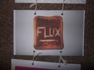
Burn
Burn was one piece that I was pleased with, but felt it was rushed, and again, isn't tactile, which is disappointing.
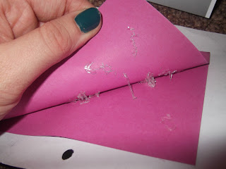
Sticky
I was really happy with how 'sticky' turned out! After looking at loads of different types of glues and adhesives I found a glue that was able to be removed and also stretched when it was pulled. I think this is my favourite one.

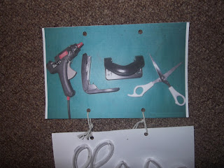
I decided to use string and bind it together myself to continue the hand made theme, I also had to allow room in the join for 3d elements on some of the pages.