With only a week for this project, I have had to make decisions really quickly on what to do.
I was unhappy with a couple of the pieces which weren't interactive, but photographed, which I think disrupts the flow and theme I was going for, but under the pressure of the deadline I had to get something done, so I did some digitally instead.
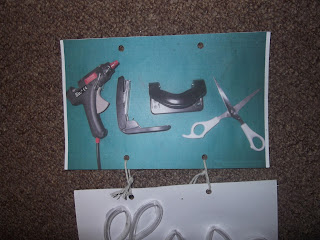 |
| Outcome |
I felt that this piece was a bit rushed, however, I liked the use of objects for their forms
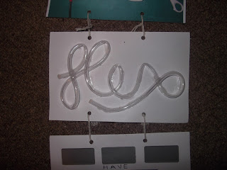 |
| Flowing |
Flowing caused a few problems for me, at first I tried filling the tubes with some coloured water so that the audience could move the page around to make it flow, however, I think that the trapped air stopped this from working very well as the tubes were quite narrow. Therefore after numerous attempts I decided to substitute the liquid for something solid. So I went for sugar as it was small and grainy. I was disappointed that what I had envisioned didn't work out, but I think that the overall concept was still put across well.
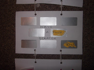 |
| Random |
I felt that this was really interactive, the only down fall being that you can only do it once. I kept the piece as plain as possible so that there was no reason for the viewer to pick a specific section to scratch off for any particular or unconscious reasons.
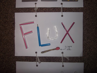 |
| Toxic |
Although this isn't exceptionally interactive I felt that the concept of doing these things made it more so. I used items that would be toxic if you were to burn them, from plastics, to treated wood.
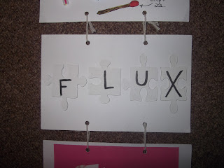 |
| Dysfunctional |
Being unable to put a jigsaw together makes it useless and not serve its function. I decided to keep the pieces plain and fix them down because if the viewer did manage to assemble the jigsaw it would defeat the whole point of the piece
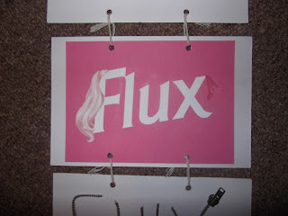 |
| Plastic |
Using barbie as influence I simply designed the word flux and barbied it up, using pinks, the long blonde hair and pink heels, also mimicking the logo with the fonts and positioning. I was happy with the piece, but again I feel it ruins the flow of the hand made and interactive theme I was originally going for.
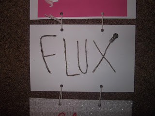 |
| Spiky |
A zip isn't something you initially think will be spiky, but putting it on its edge make any viewer instantly want to touch it, realising themselves the texture.
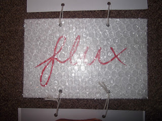 |
| Tempting |
I'm really happy with the outcome of this. I decided to use a red italic curvy font behind the bubble wrap to continue to portray the sense of temptation. I experimented with cutting the letters out of bubble wrap, but often that lead to some bubbles being destroyed, and I found a bigger surface area far more inviting.
 |
| Burn |
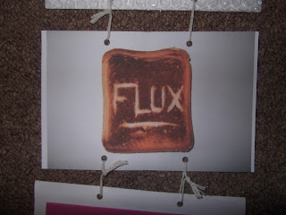
Burn was one piece that I was pleased with, but felt it was rushed, and again, isn't tactile, which is disappointing.
 |
| Sticky |
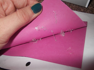
I was really happy with how 'sticky' turned out! After looking at loads of different types of glues and adhesives I found a glue that was able to be removed and also stretched when it was pulled. I think this is my favourite one.
I decided to use string and bind it together myself to continue the hand made theme, I also had to allow room in the join for 3d elements on some of the pages.


No comments:
Post a Comment