 |
| I looked at the circles of paper cut by a hole punch, thinking perhaps I could use these circles in some way on the poster - using sections and cut outs of paper. |
 |
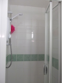
| I looked at my shower because there's about 100 tiles there and its a very clear grid. I could use an obvious grided layout in a tile format for my poster? Create things in each section? Use different colours or textures of paper for the squares? |
 |
| Even though this about 400 sheets, I looked at a stack of paper, maybe I could cut into it to create the text? or photograph it well to capture the lines in the stack? I could flick through the paper and capture it to see the motion? However if I were to use to just 100 sheets it may be too thin... |

 |
| I looked at elastic band balls because there can be hundreds of elastic bands holding this structure together, also its very built up, like GF Smith paper is! I could recreate a rubber band ball using strips of paper. Perhaps incorporating the text in the strips? or adding the text onto the poster? |

No comments:
Post a Comment