Wednesday, 30 November 2011

PPB Alight - Altering the silhouettes

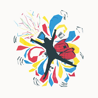
As well as altering the appearance of the image as a whole I used the initial exploding shape laying different silhouettes on top to show how the image could be altered to suit a different event or venue throughout the day:

I had to edit the initial image to remove the person and fill in the middle of the shape so that when different shapes and sizes were laid instead the middle continued the image

Dance

Dance

Performance 

Music

General Image - Energy/Celebration

Music

Music

General Image - Unity

PPB Alight - Idea Development

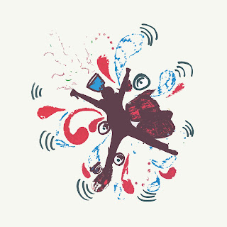
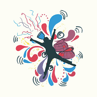
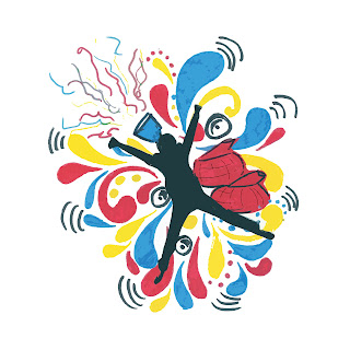
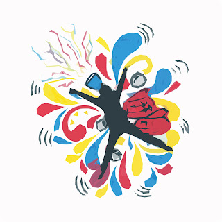
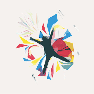
Using the 'cutout' effect on Photoshop, I played around with the settings changing the number of levels, edge simplicity and edge fidelity 

The fewer the levels the more printed & rough
the image looked
Fewer levels left fewer colours in use
This effect brightened up the colours and solidified the
shapes and colours from scanning. 
The higher the simplicity the more sharp the
shapes became
I love the effect it had on the streamers and the hubs
The higher all the levels were the more abstract
and sharp the image became. 


Tuesday, 29 November 2011

PPB Alight - Initial Ideas

I started getting some ideas down on paper of some initial thoughts towards branding, getting as much of a range as I could:

General ideas from the name and events in the festival
I then decided that I wanted to represent the feel and energy of the festival itself, therefore, centring my ideas around that statement and movement:

These ideas focus a lot on the creation of movement

These designs experiment a lot with colour and what that could lead to 

In these ideas I was trying to get some colour and energy into my designs.

These designs show how I'm trying to incorporate energy, dynamics and movement

Saturday, 26 November 2011

PPB Alight - Branding Influences

I came across the company Roandco, a New York based design company, via twitter, and found their work to be extremely influencing! More than just the design of the work itself, what the company stands for is perhaps the most important and inspiring thing that I came across:


METHODOLOGY: 5 THINGS WE FOLLOW

1. Clients are involved, clients are listened to, clients are inspiration.
2. Challenging and moving beyond what’s already been done is just the beginning.
3. Different for different’s sake: Wrong. Uncommon ideas that are intuitive and exciting: Right.
4. Old meets new. Masculine meets feminine. Capturing the balance is what brings our branding to life.
5. The consumer is as important as the client. We consider how the message is delivered on paper, over the web, and into your iPhone from here to Tanzania.


Roandco covers such a wide range of design, from web, to branding, everything! So for this project I looked specifically at branding work and loving not only the range of clients, but the outcomes. 


I feel Roandco's work has reinforced the fact that at the end of the day, it is all about what the client wants, the company's work differs in so many areas, yet, the simple and clean approach ties them to the company with the style in which it is executed. 

Friday, 25 November 2011

PPB Alight - Branding!

Right, branding it is. So I've looked at different festivals and their branding, looking at their use of colours, shapes, how they appeal to their target audience etc...

Wednesday, 23 November 2011

PPB Alight - CONFUSED.COM

There has been a lot of confusion within the General Graphics group whether we have to do branding or not, or whether we could do something else. After talking to numerous tutors who all told me something different, I went to the session this morning, asking for a simple answer.
To cut a long story short, yes. We do the branding, and then perhaps develop it into something else, like the artefact, or posters, or... whatever... So we should look at doing 2 things, branding and something else...

Confusion over. 

Sunday, 20 November 2011

PPB Alight - Generating Ideas

At the moment, I'm still not sure whether I have to tackle the branding or not as different people have told me different things. I'll clear that up once and for all in the morning with Shaun. 

So over the past couple of days, as well as trying to figure out what it is I am meant to be doing, I started just getting some ideas down on paper, covering possible branding and artefact ideas....


I'm finding it hard to focus my ideas and efforts when I'm still so unsure on what is expected... 

Friday, 18 November 2011

PPB Alight - General Graphics Session

In our graphics session with Shaun Friend we decided to pin down exactly what alight was, everybody seemed to be finding it difficult to come to terms with as the project is just sooo broad. Therefore, as a whole group, we looked into the brand values, the needs, and the audience.

This was really helpful to do as a group as I feel everyone came away with more understanding of what was expected and what alight even was. I know personally it cleared up quite a lot of questions.

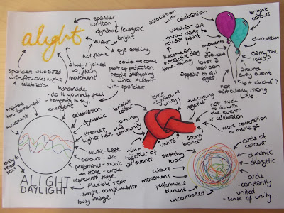
So, to confirm all these ideas we'd been through in the session in my own mind, I sort of re did the mind maps we'd done in the session on my own, seeing if I could come up with anything else or expand further....


We were also asked for a statement of our approach to this project, therefore, this meant deciding what alight was all about. I mind mapped a few statements I felt summed up Alight:


Wednesday, 16 November 2011

Professional Practice Brief - Alight!

Meeting the Client: 

From meeting the client we were able to find out more about this live brief we were set, allowing us to ask questions and gather as much information as we could about the event itself and what it was about:

- 3rd March 2012 (Saturday)
- Based in Sheffield
- Presented by the BBC and LOCOG - 'to create excitement in the lead up to the London 2012 Festival, the finale of the Cultural Olympiad - associated with the celebration of the build up to the Olympics, but not allowed/funded to actually be associated with it... 
- 1 of 15 major music projects in the national event
- Led by Sheffield Philharmonic Chorus
- Celebration of music, dance, art, performing arts
- People of all ages/abilities participating - Bringing everyone together
- www.alightmusicnation.co.uk 
- 'Unite, Arise, Alight'

We found out that there was 3 parts to the Alight event:

Alight Daylight (12:00 - 17:50)
 - Range of different events
 - Different venues - Winter Gardens/Hubs/Town Hall/Victoria Hall...
 - Mostly free
 - Target audience general public/families and friends of performers
 - Interactive day

Alight Twilight (19:30 - 21:30)
 - Paying, ticketed event - mostly sold out
 - Audience of family and friends of performers
 - Fully directed show
 - At the City Hall
 - 500 local performers

Alight into the Night (21:30 onwards)
 - Held at the hubs
 - Target Audience of those involved/students/general public
 - Music into the early hours

Wednesday, 9 November 2011

General - Repeat Pattern

I created another pattern again using the elements from my original drawn pattern

Original design

Pattern tile-abled

Repeat Pattern

Action Plan

Throughout the module I've been reflecting on my own work and myself as a designer, therefore, I am putting together an action plan to guide and develop my skills as a Graphic Designer.

1. LEARN! - My first call of action is to continue to learn, developing my skills, and absorb as much information while I'm still at uni, with endless hours of help and resources available to me at my fingertips. I will make the most of all the things I can access at Uni, take advantage of the specialists I have around me and make sure I attend the guest lecturers as well. I only have another year and a half really to take advantage of everything!

2. EXPERIENCE! - I need to build up my work experience, even if it means working for free or little pay. Getting as much experience in the industry will be invaluable. I'm going to gain some placements over the summer where I have the most time on my hands to devote to the placement so that I can be switched on and have no other distractions. I did 2 placements over the summer in London, so I am looking to get some more when I am home again, as London experience will only help in getting my foot in the door for the future.

3. PORTFOLIO! - I will continue to build up my portfolio, not only with university set projects but work I do for external clients, the wider the range of work I can maintain the more appealing my portfolio will be to potential future employers.

4. GET ONLINE! - I will actively get online to get my work out there, joining twitter, making a website, blogging more frequently outside of my university blog. When you search Kayleigh Foy on google, I will be the first one there.

5. PASSION! - The most important thing is to keep my love and passion for design fresh and alive. If I'm not passionate who else will be passionate about giving me a job? A piece of advice I took from Paul Finn - 'take 30 minutes a day and do something creative with it'. I think this is a great piece of advice, doing something thats just for you, nobody else, nobody else even has to see it. Just creating outside of any briefs or projects. Just because thats what I do. Create.

Sunday, 6 November 2011

General - Pattern Series Development

Using the same sized tile, I simply altered the previous designs to fit the tile size of the Ornate pattern, as this would be the most complicated to edit. Therefore I did as little to that piece as possible.


Now, each tiled image is exactly the same size, therefore the grid for each is identical, leaving only the pattern to change and portray the journey from simple to ornate.

However, I need to create 1 or 2 more to slot in between the centre and right patterns, as it jumps quite drastically 

Saturday, 5 November 2011

General - Pattern Series Reflection

Development of pattern series:


I printed off all of the patterns I had created and put them together to see the progression. After seeing them up and in front of me, I decided that I need something in between the middle pattern and the ornate pattern, as there's quite a big jump.

Also, I think using the same number and shape of tiles will help unite the piece as a whole. As the patterns differ in size and layout. From numerous squares, to fewer rectangles.

Friday, 4 November 2011

General - Ornate Pattern Making

Getting ornate:

To make the complicated pattern I used the pattern I created out of the cut outs:


I scanned this image in, applied the steps to make it repeat, and filled in the remaining area with the elements I had been using to create these cut outs.
This made the pattern very busy and ornate. I find that this pattern works well in how you can't find where it repeats very easily.

Wednesday, 2 November 2011

General - Diagonal Repeat Patterns

Getting more complicated:

To further my designs and get them on the journey towards ornate, I made a pattern a little more complicated than the first. I also tried out making the pattern join diagonally like I did in the bird pattern, again using the same tile technique as before: