Using the 'cutout' effect on Photoshop, I played around with the settings changing the number of levels, edge simplicity and edge fidelity
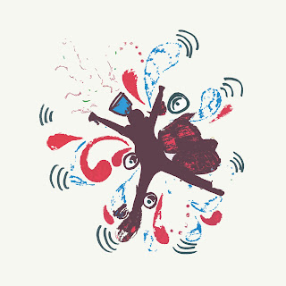 |
The fewer the levels the more printed & rough
the image looked |
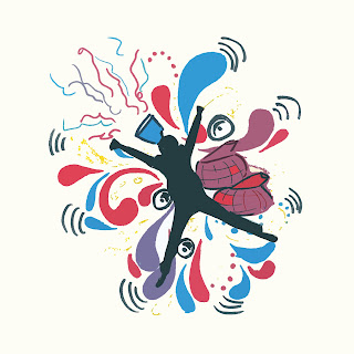 |
| Fewer levels left fewer colours in use |
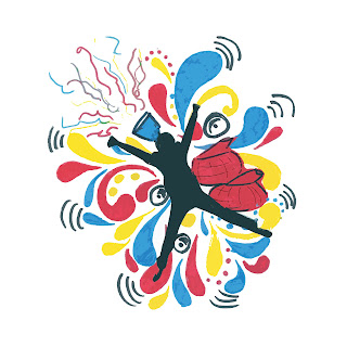 |
This effect brightened up the colours and solidified the
shapes and colours from scanning. |
 |
The higher the simplicity the more sharp the
shapes became |
 |
| I love the effect it had on the streamers and the hubs |
 |
The higher all the levels were the more abstract
and sharp the image became. |


No comments:
Post a Comment